Membership $50 a month · Certification $250 one time. Join now →

Brand guidelines

Clear thinking. Useful work. One shared identity.

A practical guide to how Wicked Growth Club looks, sounds, and teaches. For the people creating our pages, sessions, videos, and everyday work.

Our working promise: Learn to use AI well in the work you actually do.

Make it concrete
Start with a real task, question, or decision.
Let people see the process
Show the steps, the choices, and the check.
Leave room to think
Short paragraphs, clear spacing, one useful action.

Logo & identity

Use the existing logo unmodified, on white. Keep its proportions and colors, and give it clear space. Keep it separate from certificates and credential badges.

Wicked Growth Club logo: WICKED in red capital letters with a rising red arrow, and growth club in black below
  • Use the supplied artwork as it is: no stretching, rotating, recoloring, or changed lettering.
  • Keep it on a white background until approved alternate artwork is available.
  • Don't place it on a certificate or credential badge. Those carry their own marks.

Colors

Seven colors observed on the live site. Use them consistently and check contrast on every text and background pairing.

Signal red
#EA3323
Logo, buttons, accents, large type
Ink
#111111
Headings and body text
White
#FFFFFF
Page background, logo background
Deep red
#B8231A
Small red text and links
Soft red
#FDEBE9
Soft section backgrounds
Muted ink
#5A5A5A
Captions and secondary text
Rule
#E3E3E3
Borders and dividers

Text contrast

Ratios use the WCAG formula. Signal red with white text is below the 4.5:1 minimum for body text, so keep that pairing for large or bold text, and use deep red for small red text on white.

PairingColorsContrastUse for
Sample text#111111 on #FFFFFF18.9:1All text sizes
Sample text#5A5A5A on #FFFFFF6.9:1All text sizes
Sample text#B8231A on #FFFFFF6.4:1All text sizes
Sample text#FFFFFF on #B8231A6.4:1All text sizes
Sample text#111111 on #FDEBE916.4:1All text sizes
Sample text#FFFFFF on #EA33234.2:1Large or bold text only

Typography

We use Geist for interface and editorial text. Suggested weights: body 400, labels 600, headings 700.

Heading · 700
Clear thinking. Useful work.
Label · 600
Session 01
Body · 400
Explain a specific task, show the decisions, and help the learner check the result.
  • Use generous line spacing and short paragraphs.
  • Keep layouts readable on a phone.
  • Keep essential information as real, editable text, not inside an image.

Voice

Direct, warm, and specific. Start with a real question. Explain terms in plain language. Show a worked example, the review step, and one useful next action.

Say
“Let's take one customer question and turn it into a follow-up you can review.”
Avoid
“Unlock limitless growth and put your revenue on autopilot.”
Say
“Build a follow-up draft you can review.”
Avoid
“Put your revenue on autopilot.”
Say
“Use the approved facts and flag missing information.”
Avoid
“AI always gets it right.”

Humor can reflect everyday work frustrations. Never shame beginners, and never use unsupported time savings, revenue claims, guarantees, or invented testimonials.

Session graphics

Eight cards for the weekly live series, each with the session number, a plain title, and the one thing you leave with. These titles are proposals for the live series. They are separate from the AI for Sales certification curriculum.
Session 1 graphic: Choose your AI project. A clear brief and a definition of done.
1. Choose your AI project
A clear brief and a definition of done
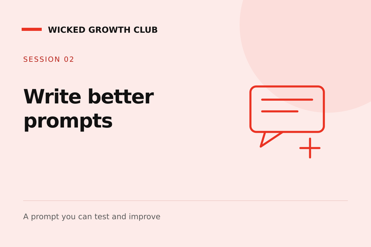
Session 2 graphic: Write better prompts. A prompt you can test and improve.
2. Write better prompts
A prompt you can test and improve
Session 3 graphic: Organize your inbox. Triage rules and clear next actions.
3. Organize your inbox
Triage rules and clear next actions
Session 4 graphic: Map your sales process. A visible path from inquiry to decision.
4. Map your sales process
A visible path from inquiry to decision
Session 5 graphic: Build useful follow-up. Three drafts, each with a purpose.
5. Build useful follow-up
Three drafts, each with a purpose
Session 6 graphic: Create useful content. A plan built around customer questions.
6. Create useful content
A plan built around customer questions
Session 7 graphic: Build a small workflow. A repeatable process with a review step.
7. Build a small workflow
A repeatable process with a review step
Session 8 graphic: Check what worked. Evidence and a practical next step.
8. Check what worked
Evidence and a practical next step

Imagery

Use real instructor photography for real people. Neutral paper-collage illustrations explain the work and never imply real software results. Use actual screen recordings when demonstrating software.

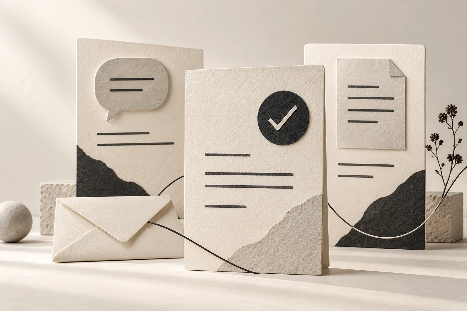
Paper-collage illustration of three tall cards with a speech bubble, a check mark and a document icon, joined by a thin line, with an envelope in frontIllustration
Weekly live series overview · Overview
Paper-collage illustration of stacked envelopes, sorting boxes and a card with a check markIllustration
Inbox instruction · Inbox lessons
Paper-collage illustration of torn scraps becoming organized pages beside a laptop and a notebookIllustration
Sales follow-up · Follow-up lessons

Downloads

Working edition, October 24, 2026.

The Wicked Growth Club name and artwork identify Wicked Growth Club. Please do not use them to suggest an endorsement or affiliation we have not agreed to, and never alter a certificate, credential ID, or instructor identity.